Medical cosmetics approached us wanting a re-design for their website. They are a leading aesthetic clinic with 10 years’ experience specialising in a variety of different treatments. They wanted to get their website up to date and refreshed with a re-brand that reflects their professionalism and personality.
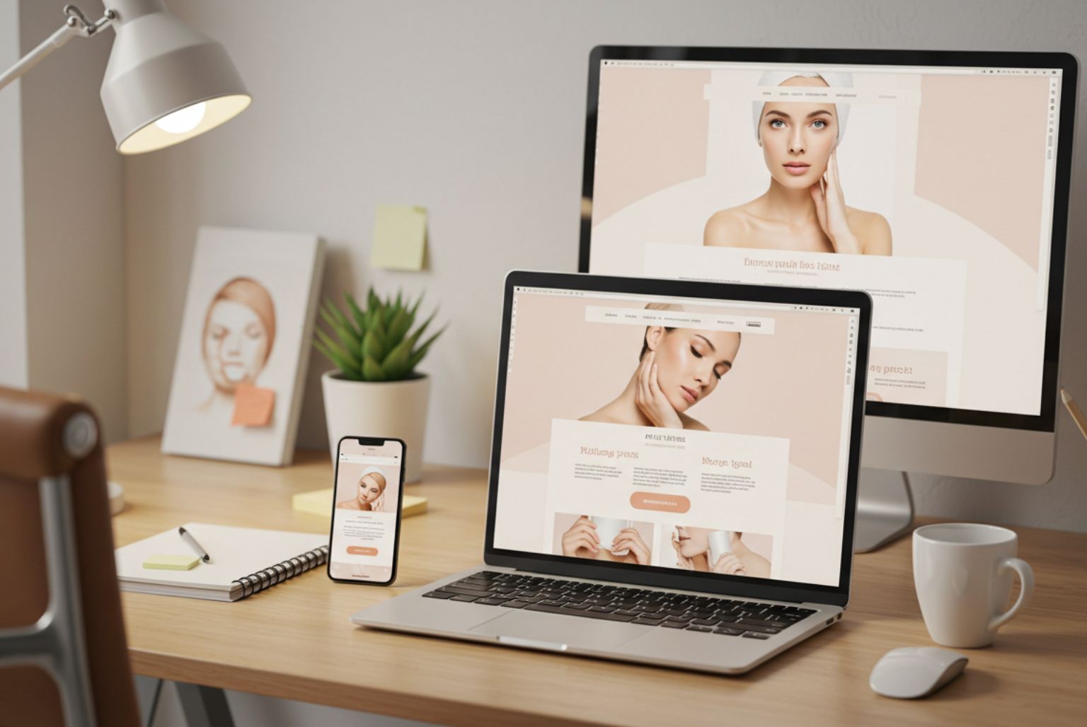
Some of the finer points of this re-design is that it is now open and light. It is also structured with the content laid out in a way that makes it much easier to access their helpful and informative advice on the different treatments they have available.
The new design is a lot more streamlined than previously, where it was long pages filled with a lot of information to read, it is now short and precise with no need to read walls of text.
The navigation was an improvement where we have made a particular effort to create sections that will help the patients find their treatments that much easier through the use of a conditions page. Any new patient who is unsure of what they need, can use the conditions menu which will then direct them to the appropriate treatment or procedure.
Overall, the design and user experience is very slick and sleek and resonates the sophistication of a forward thinking and modern aesthetic clinic.
