


Dubbed ‘Mobile-geddon’, on Tuesday 21st April 2015 Google began rolling out a major algorithm change aimed at ensuring that mobile-friendly websites are prioritised in search engine results pages (SERPs) for people using a mobile device to run their search.
It makes sense that Google would choose to prioritise this. Back in November 2014, the long-predicted tipping point finally came and mobile searches overtook desktop searches for the first time. It’s a trend that looks set to continue.
You can see whether your website is mobile-friendly by searching for it on Google using a mobile device. Mobile-friendly websites have a small ‘mobile-friendly’ label next to their listing. You can also go to Google’s mobile-friendly test page and check the URLs for your website.
Does responsive design make a difference?
In a recent Q&A session about ‘Mobile-geddon’, Google’s Webmaster Trends Analyst, Gary Illyes, advised people that responsive design doesn’t have a clear ranking benefit. However, with the new algorithm, having a mobile-friendly website will affect your rankings.
Illyes explained that mobile-friendliness is determined at a page level rather than a site wide label and that the Googlebot must be allowed to crawl your CSS and JavaScript to pass the ‘mobile-friendly’ test.
Responsive web design vs. a mobile version
For the time being, it is arguably enough to have a desktop and mobile version of your website but, as we discussed in our recent article – 5 reasons why your website needs to be responsive – this isn’t ideal as you have to keep both versions of the site up-to-date and you can’t necessarily guarantee a consistent customer experience. There can also be issues with getting a separate mobile website to present an optimal display on intermediate resolutions.
Another thing to consider, if you have a desktop and mobile version of your web, is that you will need to utilise canonical tags properly if you have the same content on both websites, otherwise you could risk a penalty from Google for duplicate content, which could affect your hard-earned rankings.
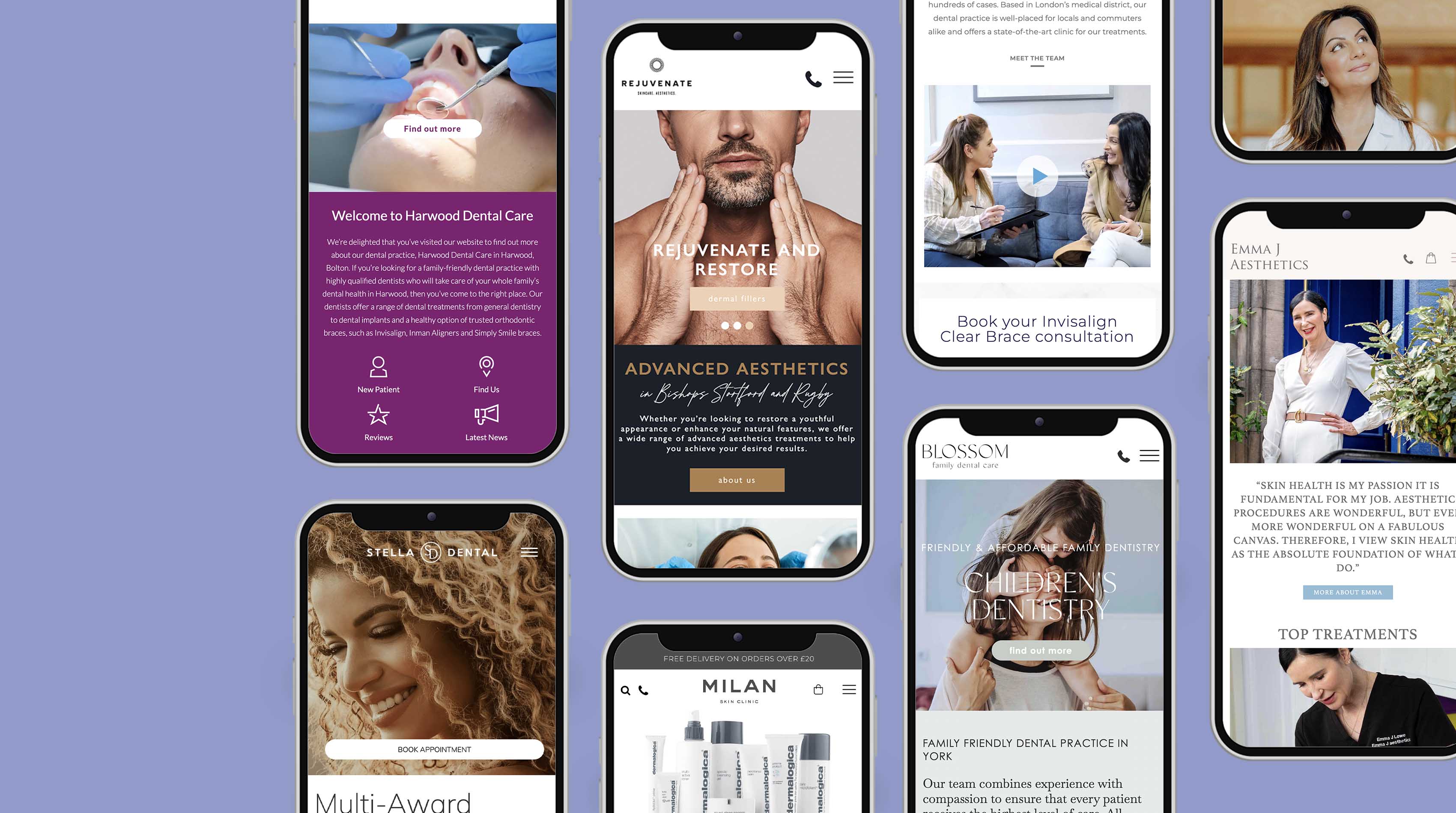
Ideally, responsive web design is the best option for creating a mobile-friendly website. You only need to do one set of updates, manage one site, and you can provide the same customer experience whether someone’s viewing your site on a desktop, laptop, smart phone or tablet. Responsive websites can adapt to any screen resolution, displaying the website in the best way possible across all devices.
With responsive web design, you only have to approach the search engine optimisation with one website in mind, as well as link-building for one site rather than two. Although some studies suggest that mobile-only websites may convert traffic to sales more effectively than the majority of responsive websites, this can be overcome with careful design and consideration of the buyers’ journey through your website.
To find out more about responsive web design in Nottingham and whether you need a new mobile-friendly website or changes to your existing site, call H&P Design on 0115 914 0640.