


Mistakes can be costly and time-consuming when designing your identity and creating the right brand for your practice, location and the clients you’re targeting.
I don’t need to try and convince you of how important a strong brand for your practice is in today’s competitive marketplace of Dentistry and Facial Aesthetics. Most professionals in Dentistry know the importance of branding, there are plenty of speakers out on the circuit who lectures on the subject and plenty of well-known books such as ‘the Purple Cow’.
Even if you’ve just bought yourself something because of how you feel it gave you; perhaps a watch, underwear, or simply one can of soft drink over another, then you already understand what’s at the very heart of branding, perhaps without even knowing it.
Branding really does influences our purchase decisions. We ignore information we really should know in favour of perception. We choose to fly with an airline that feels the best based on what we are prepared to pay; our decision isn’t based on safety records but on how that airline makes us feel. And why do we buy t-shirts or underpants with logos on, they don’t last any longer and half the time aren’t seen either.
A gut feeling
There are many ideas and definitions out there on branding, but the best of them will point you all in the same direction of emotional perception and feeling about a product or service.
The core reason behind investing in a visual identity and a strong brand for your clinic is to attract loyal long-term clients and increase the market value for the clinic. To do this clinics have to focus on the perception, promise or previous experience of potential and existing clients, clinics have to separate themselves from the pack and create segmentation for their clients.
As much as we would like to think of our skills and clinics as unique, the truth is there are many others who offer similar services within similar environments, which is why your brand plays such an important part in the success and growth of your clinic, your brand helps clients navigate through the daily clutter of messages, promises, features and benefits. Whether you’re opening a new clinic from squat, buying an existing clinic or wanting to breathe some life or change direction in your current practice.
Creativity is key
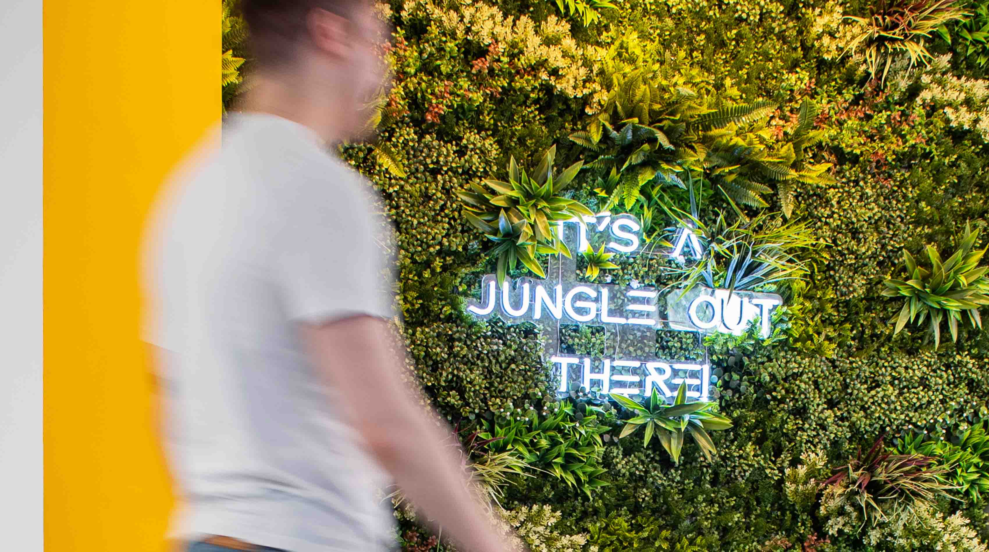
Unfortunately, I see many practices that understand the value of branding, that have invested in designing an identity and key patient brand touch points for their practice such as stationery, signage, patient welcome packs and a website all with the aim of creating and establishing a strong unique brand. However many sadly end up looking like so many other practices. Wouldn’t it be cheaper to just remain as you were without the money, blood sweat and tears, after all a brand is something unique to you and your clinic? We each make our purchase decisions based on our perceptions, emotions and trust, first impressions are so important. Often clinics are scared to be really different and yet want to be remembered.
Designing eye-catching stationery
The stationery we design helps clinics communicate to their clients their brand values, promises and a sense of standards. Stationery is another opportunity for subtle additional marketing such as your other treatments. It’s a fine balance between aspirations and communication that engage your clients so that they remember.
I believe no colour is off limits, even red; if a company whose name is Virgin can use it with great success and in diverse industries then any dental or facial aesthetic clinic can. Bright colours work well if they grab your attention but please use them with respect. We created the brand for Evolve Dentistry, in Portishead for Dr Carol Somerville Roberts using a strong lime and warm chocolate to great effect. Lime would often be considered too gregarious even tacky for contemporary practice, however, it works well, gets visual attention and feels understated. Using metallic colours can also give your identity something extra. The inks catch the light well and really say ‘extra special’. We recently designed the brand for True Dentistry in Bolton and created its identity using metallic silver and copper. We designed the stationery with a solid copper on the back with their logo typeface and treatments in white which created a watermark effect and didn’t cost any more to print.
Printing your letterheads in-house
Some dentists prefer to print their letterheads in-house to save print costs and storage can be precious. This can limit the overall design as printing in-house prevents printing anything on the back. It’s also practical to have a small batch to provide treatment plans or welcome/introduction letters. When it comes to invoicing a black-and-white laser version is fine, after all, no one likes getting a big bill, especially on fancy paper.
If you’re keen on complimentary slips there are no hard fast rules, even including the actual words ‘with compliments’. A vertical comp slip can also look a little different. If you are printing your letterheads in-house then having an extra special comp slip looks the part. Perhaps a foil or die cut, if you’re charging a pretty decent fee make them realise you appreciate their business. The most important thing however is that it’s sincere, it’s the item that’s personal, also try to always write on it, anything just something.
Whilst all your stationery needs to feel it belongs and is designed with the same look and feel, what works well is each item is slightly designed differently. This keeps your clients better engaged. Each item will still feel like part of the family but have its own personality.
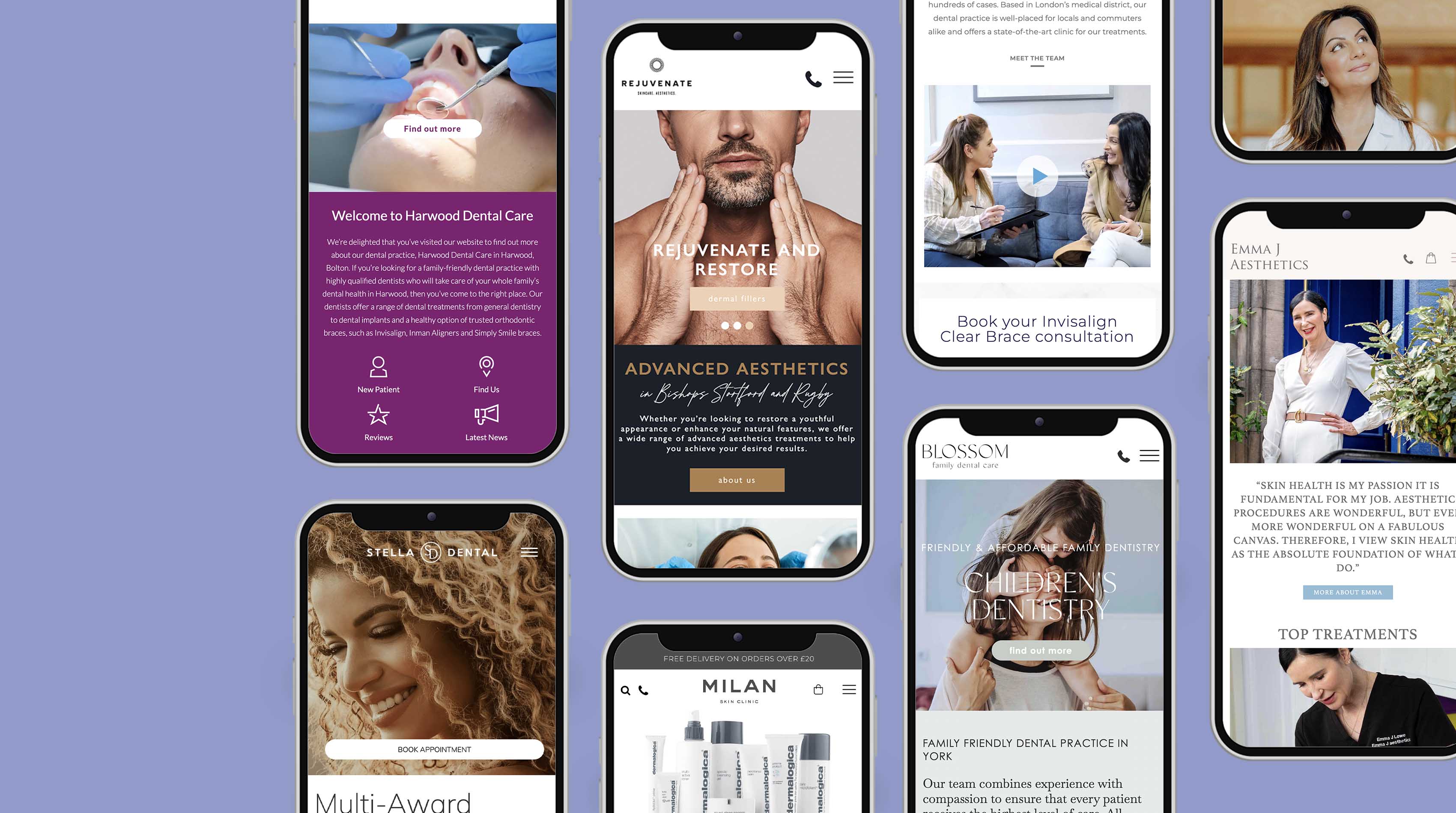
The jewel in the crown
Most clinics want a website, but not every clinic feels it needs a patient brochure or welcome pack. Can’t we just give them a leaflet? Well yes, you can, but just hope they don’t find the clinic down the road that provides similar treatments at a similar cost as they will be sending out a message they invest in themselves and in their services. Many however estimate how emotive a clinic welcome pack really is. Everyone has slightly different ideas of how a welcome pack should be. In some shape or form you need to be making clear clinic T’s and C’s such as cancellations and payments, a welcome note ideally and then some sort of intro or overview into what you do/help your clients.
We’ve designed many shapes and formats, however, we find clinics say clients prefer an A5 format simply due to practicalities and postage. That said, it doesn’t mean you can’t be different with your design. It’s all about their pre-patient journey, which the welcome pack is all about.
They’re many ‘touch points’ that a client will experience with your brand; When contacting you, learning about your treatments, registering as a patient, waiting for treatment, their actual treatment, paying for it and in between visits, the welcome pack serves to introduce and leave a flavour of the experience and reach parts of their decision-making process that a website will not.
Design claustrophobia
When designing your welcome pack information is vital but don’t make the mistake of cramming it with too much. The overall feel and design of your identity need to breathe, it’s better for potential clients looking to join the practice or existing clients looking to invest in their appearance being left hungry rather than overloaded. It’s similar to when we are online, we look at sites with the most information to teach us what we need to know but then go elsewhere to spend our money on the website whose brand we prefer.
Bigger is not always better
A common query I often come across is making the logo as big as possible as if somehow that will convince people to join the practice or make an enquiry more. Giving your logo space will give it just as much presence as if it’s 3 times as big but without looking tacky. After all, there’s a reason your car badge isn’t half the size of your bonnet. And if you’re worried potential clients might not see it, just ask yourself if you can.
The boutique effect
Most clients want clean lines and something contemporary. However, it’s all about a fine balance. You don’t want something too cluttered and busy and you don’t want something too cold and non-engaging. We have a term used to describe the effects of this which we call the ‘Boutique effect’. It comes from the commonly placed boutiques on the high street with rarely anyone in and in serving you is usually some frosty judgmental assistant who appears to weigh you up and down. It doesn’t feel approachable and likeable and you get the feeling you’re being overpriced.
This is why it’s important to create a sense of life and passion in your material, what you can do with your stationery is limiting but on your welcome pack, you have the opportunity to reach out further.
Now it’s personal
We are savvy and brand-conscious consumers in today’s marketplace, making many subconscious decisions about what we see, read and experience. By making and building your brand promise about you and your story you ensure longevity, originality and security. Unlike royalty-free images and generic treatment information, other practices can’t duplicate your story or that of your patients should you prefer to focus on case examples.
Underestimating touch
What often gets overlooked is the final print finish used on your welcome pack. This plays a vital part in your welcome pack as we need to like the look and feel of the item. We may pick something up to read but feeling positive about their investment before they continue onto details will ensure their gut feeling is more positive. Printed on uncoated stock can speak volumes about your quality and feel very understated, it can also say recycled and feel like a promo item, which is why if you are able to use a foil with uncoated stock leaves clients undoubted as to the message your saying. Otherwise, a matt laminated finish with a pot UV gloss varnish really looks the part.
I don’t want it, but don’t throw it way
You know when you receive something either directly or otherwise, you make a split-second decision. Do you need services on offer now? in the future? or never? If it’s the latter and it doesn’t look anything special you throw it away and doesn’t think twice. If it’s engaging and looks and feels really nice then it generally gets kept and put to one side.
By working closely with clients’ practices or intended locations, helps our team to focus our creativity around ideas that are unique to the client things they might not think important or worth mentioning. Every practice is unique; our experience helps us to make even a tired practice with a limited budget competitive. It is so important to be realistic and not to over-promise the patient journey through design, and photography as when they eventually come to see you will find out your actual brand experience.
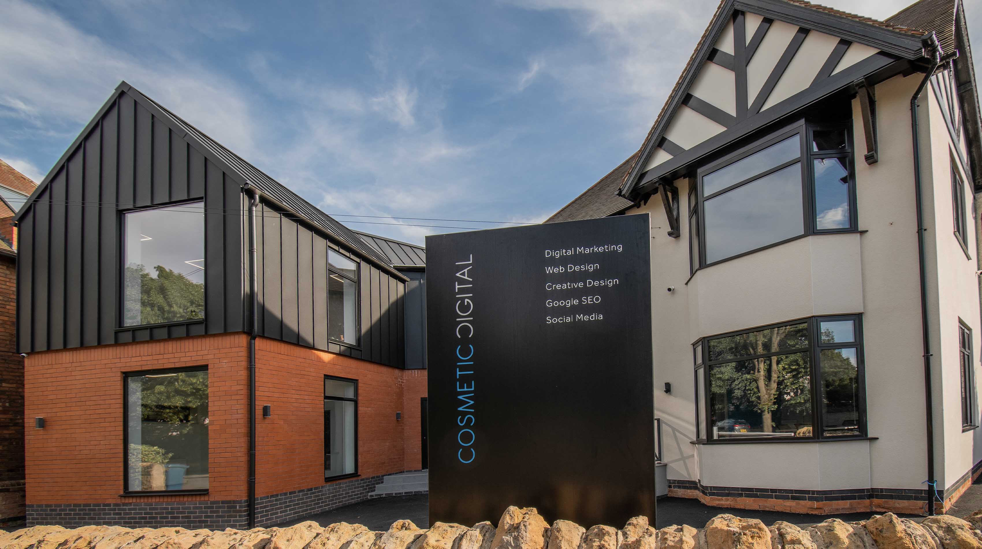
See examples of our work and receive innovative brand ideas for your clinic at Hampson & Partners, better still contact us for an informal chat about your project. You can visit the website www.cosmeticdigital.co.uk or contact Adam Hampson directly at 0115 914 0640
Hampson and Partners are Speaking and Exhibiting at the combined BACD/AACD exhibition in London this September. If you have any questions about your clinic’s brand or brand material and approaches come and see us in person.