


If your inbox is anything like mine it’s been invaded by strangers telling you that Google was updating its algorithms last month and that the world is pretty much going to end…well we’ve finally reached May so I guess we’re going to be ok.
The truth of the matter is YES – last month – April the 21st to be exact Google did update its method of how it judges your website but the question is exactly how much is this going to affect your position on Google.
Are you going to disappear over night off page 1 never to be seen again?
Will this affect your business and will you never see another new client again?
Do you really need to and stock up on dried food?
As usual we try to give our clients and those that know us the big picture. A clearer, more simple explanation in the hope that we can help to make the right decision for you to moving forwards.
Now I won’t be the first or the last to blog on this subject but we are web designers after all, so I’m hoping it carries a little more weight than the others on this subject.
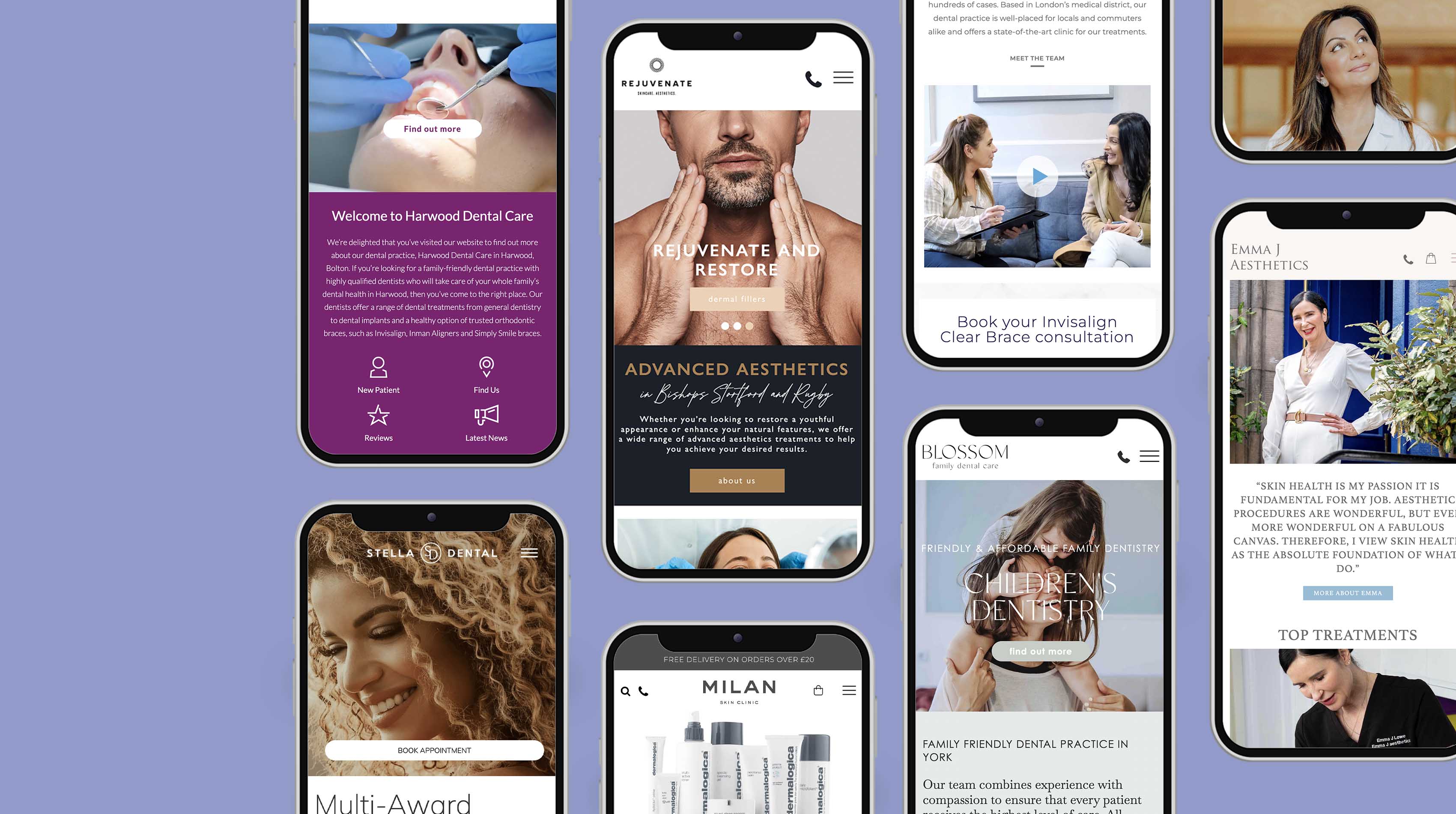
For some of you, this won’t affect your websites current ranking – if anything it may improve it – as you’ve have a shiny new mobile responsive website. For some you may have already made the decision and will be in the process of either rebuilding your website as a lot of our clients are, or having read about this, will be seriously thinking about it. I guess the rest won’t realise.
Mobile v Desktop
I’m going to quickly start with what ‘mobile responsive’ means and why it is so important regardless of Google’s checklist of ranking your website. Mobile devices used to access the web are here to stay – can we just agree on that. Whether a smart phone, tablet, watch or pair of glasses we’ve moved on from just the home desktop.
Since last year searches on mobile phones have now started to rise above the number of searches carried out on desktops. And I don’t just mean for taxis and pizzas. Clients are using their mobiles to search for pretty much everything including cosmetic and medical treatment.
As customers prefer to rely on their mobiles and tablets to access web content and shop, websites need to take on board the mobile user experience. Pages need to download fast, content needs to be easy to read and the all important navigation must be easy to use. No longer do we need to put up with finger and thumb zooming in. If your site is none of these you risk new clients going elsewhere and loosing another new client.
Anyone for a Hamburger?
Most of you will have seen the ‘Hamburger’ icon when searching websites on your mobiles. It’s the icon we associate with a menu or main navigation.
This means the website you’re on knows you’re using a mobile and is built for your mobile device so it changes how it works.
When a website can detect what device is being used to view it and changes how it works and looks then it is called responsive or mobile responsive. Most new websites are made this way, we’ve been building these for ages, but the rest will be a simple mobile version – a second often smaller website that is shown instead of the non-mobile version with perhaps the main pages instead.
Mobile responsive websites don’t just change navigation or images, but more importantly what content is actually displayed compared to when viewed on a desktop screen. And it’s this client experience on a mobile that’s most important of all.
Think about it, most of us still have 3G on our phones so quick download speeds are crucial. Mobiles also have smaller displays so ensuring fonts and content are clear and readable. Despite us being used to scrolling more on our mobiles, we don’t have the attention span compared to when we use a desktop. So you need to give your clients the key information they need to book a consultation with you or find out more so they can then book a consultation.
Google likes what we like
If your website isn’t mobile friendly, users are likely to leave your site and go elsewhere. When they do this they are ‘bouncing’ your site, which affects your ‘Bounce rate’ – the percentage of visitors to your website that then leave the first page they land on. And guess what, Yep! High bounce rates lowers you Google rank score. Why? Because Google will see any website that people are leaving as a site they don’t value. And it’s this wider issue that most clinics and businesses don’t realise.
If my website is not mobile friendly will this cause my desktop ranking to go down?
Google have said No! It appears the update is affecting just mobile searches but as we can see this is going to affect nearly half of all your new clients that are using mobiles to learn more about you.
When will we see an effect on search results
We are already seeing search results on mobile devices change. Currently there are even differences between iPhone users and Android phone users for certain searches, its not 100% what the full extent is going to be. Only time and Google will tell.
How do I get my website mobile friendly?
The only way to be 100% certain that your website is going to be mobile responsive is to have it rebuilt. There are a few ‘plug-ins’ available for example Word press do one but these are not great quality and can cause other issues by not making all of the site responsive also its only for Word press websites.
For the more technical ones of you out there – In principal what your website code needs to do is change from exact pixel measurements to percentages so it is able to resize and adapt accordingly to what ever resolution (device) it is being displayed on. We also use a combination of what’s called CSS media queries and iQuery to control the functionality and what content on your website your customers can see when using a mobile compared to looking on a desktop or ipad. Most of this isn’t present in older web code.
Could I have a mobile version
Yes and this is great as a stop gap but it’s not a long term solution. Ultimately you now have two websites so making changes is now double the work, time and cost. Also I mentioned earlier mobile versions are often scaled down websites so when a client does a search on Google the result and link that appears may not then exist as a mobile version. And so would be just redirected to the home page and the user would probably then leave your website.
For more information about making your website responsive, web design and Google marketing or what to do if the world ends you can contact me, Adam Hampson on 01159 140640 or email me at info@handpdesign.co.uk
Links to help you
Is my website Google mobile friendly
https://www.google.com/webmasters/tools/mobile-friendly/
5 Google Steps For A Mobile Friendly Website
http://services.google.com/fh/files/misc/mobile-friendly-starter-guide.pdf
Google Mobile Update Article
http://googlewebmastercentral.blogspot.co.uk/2015/04/rolling-out-mobile-friendly-update.html