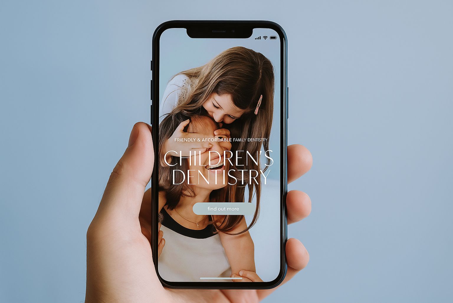
These days, more or less everyone knows that it’s important to give customers a good mobile user experience – or ‘mobile UX’ – when viewing a website. This is because approximately 60% of searches now come from mobile devices.
But while most companies would say that mobile UX is important, how many are really getting it right? It won’t cut it to just create a responsive design that scales down to any size screen because it doesn’t take into account the demands of a good mobile user experience. A successful site isn’t just responsive but is edited to respond to the needs of different users on different platforms.
With this in mind, we’ve put together our thoughts about how to create a fantastic mobile UX for your site.
1. Know your audience
As with all aspects of marketing, it’s essential to understand your audience. Broadly speaking, mobile users fit into one of two categories: hunters – those who want to find specific information or accomplish a specific task quickly – or gatherers – those who are browsing, researching information for comparison purposes to help them make up their minds, filling in their time, and generally not in a rush.
People’s behaviour can change according to the time of day and device they’re using. For example, they might use a mobile phone to complete a specific task when they’re short on time at work, but turn to their desktop or tablet for information gathering when they’re sitting in front of the TV in the evenings.
2. Keep things simple
A great mobile UX generally goes hand-in-hand with simplicity and ease of use. In our experience, each screen of your website – when viewed on a mobile phone – should support a single action that’s of real value to the user. This might be a screen that’s for booking an appointment or a screen about a specific treatment.
The key is to strip away any content that isn’t 100% necessary to the task the mobile user wants to accomplish – this might mean hiding some of the copy, for example, or stripping away links to other treatments that work well on a desktop but make a mobile screen look cluttered.
3. Make room for white space
Jan Tschichold, a typographer and book designer who played a seminal role in developing graphic design and typography in the 20th century, once said: “White space is to be regarded as an active element, not a passive background”.
This advice holds true more than 40 years later, especially when creating a fantastic mobile UX. As mobile screens are so comparatively small, it’s tempting to cram in as many design elements as possible before the user has to scroll down the page. But this can be a disaster. White space lets people breathe, it lets the essential elements on a mobile screen stand out, and it signposts what to do next.
When we develop sites with a view to the mobile user experience at Cosmetic Digital, we always explore whether an element really needs to be there or whether we can give more ground to the white space on the page.
4. Make your navigation discoverable and accessible
The best way to present the navigation of a website for mobile users is a topic for hot debate. It needs to be discoverable and accessible without taking up the full screen when a person first lands on a website.
Many websites feature navigation bars – often dubbed the ‘hamburger menu’; this is an icon, typically to the top right of a mobile screen, featuring three horizontal lines.
Detractors of the hamburger menu icon argue that it’s not immediately obvious that you’re looking at the navigation menu, meaning that key features of a website can go undiscovered. However, navigation bars are so widely used now that the majority of mobile users recognise the purpose of the icon.
There are other mobile navigation alternatives that we’re likely to see more of moving forwards. These include:
Prominent floating hamburger menu icons
- Tabbed menus (like those seen on Instagram) that use icons to denote the contents of the page
- Tabbed horizontal menus featuring text
- Swipe menus (inspired by apps like Tinder)
- Slide out navigation tabs that can be dragged out from the side of the mobile screen
- Labelled menu button where the hamburger menu icon typically sits
Every navigation option has pros and cons, and will be influenced by your audience and the design of your website.
5. Use clear iconography
More and more websites are using icons to represent and signpost content. This translates well across all devices but is especially popular for mobile users as clear iconography is a great space saver. Of course, the word ‘clear’ is paramount here – the icons used on websites must give an at-a-glance understanding of what they mean.
6. Optimise your images
Mobile users tend to be time poor although, conversely, they also spend a lot of time online so they are savvy about good vs. bad user experiences. These two traits mean that many mobile users lack patience with slow, hard to use websites.
The mobile UX can be damaged by having large image files that slow down page speeds. This means you should always take time to optimise your images.
7. Design for small screens
As we’ve mentioned above, people typically come to websites via their mobile phone to complete a task. A barrier to this is small call to action buttons or buttons that are too close to other interactive elements of the page. If you want your patients to hit a button that says ‘Book now’ or ‘Sign up’, they need to be able to do this without accidentally navigating to another page of your website because the button was too small or crowded to be used on a mobile device.
Conclusion
There are many ways to enhance the mobile UX and we’ve only scratched the surface here. Key elements such as consultation booking forms, maps and directions, step-by-step treatment guides, icons and intuitive, clear navigation are just a few of the things that can be edited to give mobile users the best possible experience.


