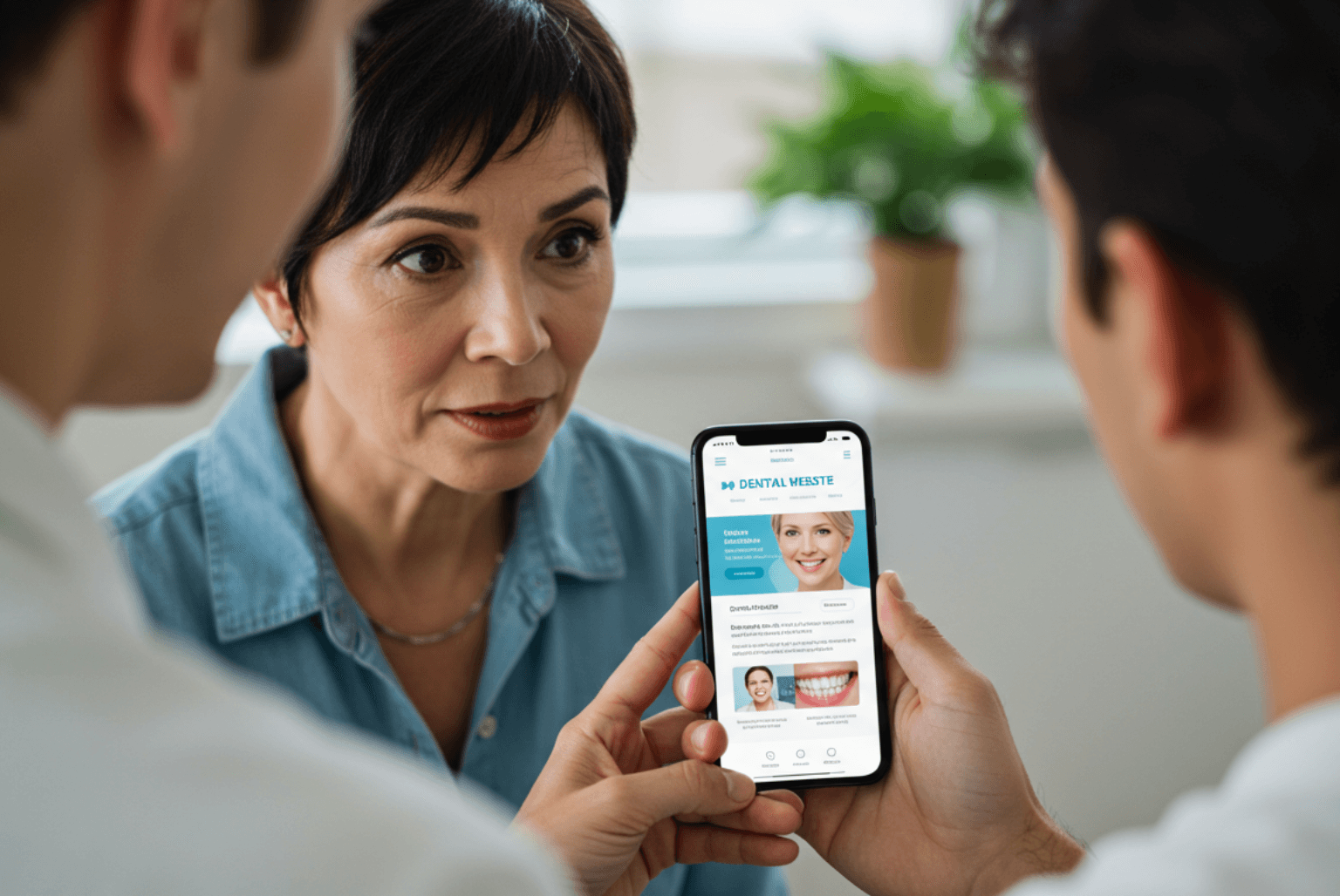
Zero Seven wanted us to create a sleek, glamorous yet approachable website to ensure they would stand out in a highly competitive London market.
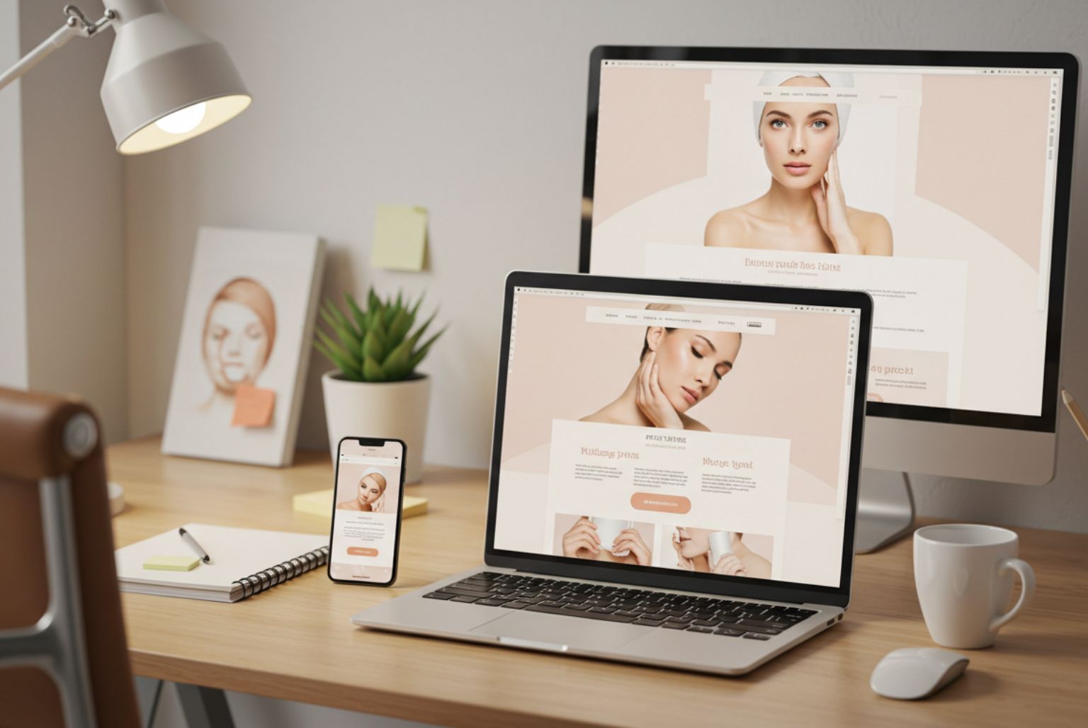
We kept the design clean and simple – the large Home page header grabs attention, as do the inspirational images used throughout the site, and the glamourous colour palate.
We added something a bit different to the sub navigation of the website. When people click on one of the main navigation options, the sub-page options appear alongside welcoming, aspirational images of people with beautiful smiles. Visitors can also book an appointment or get straight to the latest news, case studies and special offers from any pull-down menu on the site.
There’s an easy to find and easy to complete booking/contact system on most pages to make booking an appointment as convenient as possible. Typographical boxes throughout the website focus on offers and finance packages on all of the pages to show potential patients that treatment through a respected London practice doesn’t have to cost the earth.
Visit zero-seven.co.uk


