Website design focusing on the patient journey
H&P were approached by Lincoln Orthodontics after a recommendation from one of our clients. The specialist orthodontic practice wanted to redesign their current website to make it more patient friendly, easier to use and navigate.
Their main focus as a practice is around the patient journey. They are very keen to emphasise how much they value their patients’ and the work they do to help people change their lives. They want the patient to feel valued at every stage of their journey; this includes their online experience.
The practice is proud of their professional achievements, patient results and modern, professional care and wanted the new site to reflect this. They also wanted to increase the number of self-referrals to the practice.
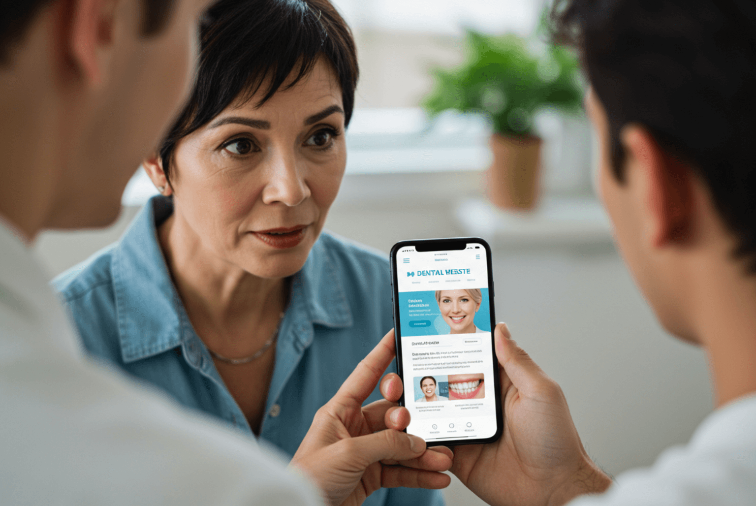
We have created a professional, clean and bright website, with more imagery personalised to the practice and their patients’, reflecting their modern, approachable style.
The layout and navigation route through the site is much more patient friendly and not just aimed at the professional referral market. The user can see treatment results, get to know more about the practice and staff as well as read about the treatment options available. This personal, friendly approach is echoed with the inclusion of an “Ask the Orthodontist” feature, which is friendly and informative, giving the patient the feeling of complete peace of mind.
The site has just gone live! Please take a look at our work, we’re very proud of it! Like something you see? Get in touch today and see how we can help your practice.
Call the H&P Design team today 0115 921 5848
Improve your business’ online appeal with our experience in web design.


