You never get a second chance to make a first impression
Why GREAT Branding and Design sets you apart from your competitors
We live in a world where first impressions count. As someone involved in the cosmetic dentistry profession, you probably understand that better than most. Every day, you see people who want the confidence that comes with a great smile because they understand that looking and feeling good invites people in and creates new opportunities. And yet, despite knowing this, a staggering number of cosmetic dental practices are not making a good first impression with their brand online.
Dentistry is a crowded marketplace with competitors ever present, both geographically and online. Even a cursory glance at Google turns up a motley host of dental clinics with template websites that look the same. The few practices whose websites are well-designed and clearly thought out immediately stand out on page 1 on Google.
Fortunately, dental practices that provide cosmetic work are beginning to think about improving their own appearance, as well as their patients’. More and more clients come to H&P Design because they recognise the need to create a brand and identity that is unique to them and sets them apart from their competitors.
What’s your brand?
So, what is a brand? A brand is the emotional value your customers have with you, your service and practice. Many practices settle upon a company name and logo (maybe throwing in a strapline for good measure) and treat this as their brand. Their template websites feature just a logo, some over-used stock images or a dash of colour, demonstrating little or no thought into the meaning of the brand or communicating to potential patients. In other words, they have failed to consider the psychological aspect of creating a successful brand.
Really strong brands are those that link themselves to thoughts, feelings, perceptions, images, experiences, beliefs, attitudes, and so on.A brand works when it creates expectations that are delivered by the product or service.Dental practices can attract and retain patients when their brand reflects their strengths, values and key messages.
Creating the right look and feel online
Clients and non clients sometimes ask us how important it is to have a website. If they need you, surely they’ll come looking?
Well, in some ways it’s true, people will always need dentists. They will come looking but, rather than pounding the pavement, the Internet will be the first place they search. How will they know that your practice is right for them? Having a strong emotive brand through your website gives you the chance to introduce your practice, invite the patient in and create their expectations, all from the comfort of their home or office, seduce them to give you their email address, call the reception, register online or react to an offer.
Dental websites are very competitive and any geographic search will generally find between six to ten different dental clinics on the first page within the organic search results. When a potential patient visits your website, you only have a second to convince them that they should give you their attention to read further. They won’t read the information on the pages unless they like the look and feel of the site, and creating the right look and feel means reflecting the practice, its values, brand message, geography and client base clearly in the brand.
In the current tough economic climate, when many companies have cut back on their marketing, there are many ‘marketing’ agencies and web ‘designers‘ offering template designs as cheap, affordable solutions.The problem with templates is that they look like templates.They lack originality and creativity, that certain something that sets your practice apart and communicates your brand.In fact, branding and templates are a contradiction in terms.
Good branding online is about to become even more important, thanks to a new Google feature which enables customers to rollover and preview a website on the results page before they have even clicked to visit it. Even though your website may boast the best written copy or a fantastic offer, no-one will ever know if it looks the same as the website preview that’s at a position above or below yours.
In our experience, if someone is searching for a service and they find a stunning website that stands out visually amongst others, then they will give it more of their time to take another look. Once you have captured a visitor’s attention, it’s down to the material and language you use to convert their interest into business.
And this is an important point – when we talk about successful branding, we are not just referring to good design. All of the well known brands create a look, feel and language that reflect the values and emotions of the product. When establishing your brand, you need to consider whether you are using the right tone and words on your website, as the words you use have a huge and often overlooked effect on your customers. As we know at H&P Design, the detail is key.
Using the right image
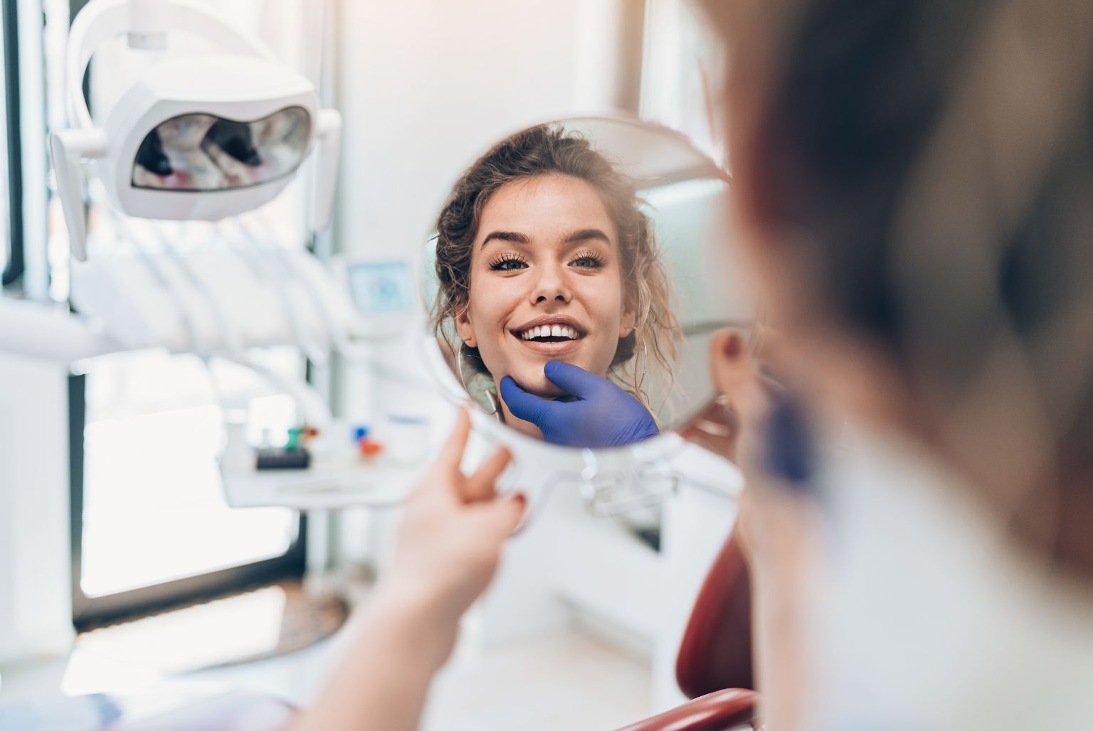
While we’re on the subject of detail, here’s one that we’ve noticed – most images on dental sites are the same. In fact, there’s a well known woman with a great smile in both brunette and blonde used to excess. When we see this picture (and others like it) on a website, it doesn’t communicate the message of ‘we are experienced dentists with a special interest in cosmetic dentistry’; instead, it says ‘we have no imagination and are no different to everyone else’. We have a few design rules at H&P Design and not using her is one of them!
Using the right images is an important part of communicating your brand but often presents a stumbling block because it is a challenge to find something original when it is so cost effective to use royalty free images. Most people only know of istockphoto, and istock is only as good as your ability to use it. H&P Design has spent time trawling through American images and contrived shots to turn up some real gems that have not been used by other dental clinics. In doing so, we have learned how to get the best out of istock. We also try to use other royalty free websites or purchase royalty free CDs for clients. Although the initial outlay is expensive, it prevents the vast majority of the competition from copying the same image and helps to put a unique stamp on a clinic’s brand identity.
Finding the colours that fit
A lot of dental practice websites look flat and boring online – a far cry from the professional service they are trying to promote. The power of colour on a website cannot be underestimated – many companies are guilty of just using the two or three colours that appear on their stationery, rather than adding to these by introducing a rich and complimentary colour palette.
More colour can be introduced very effectively just by choosing the right imagery – perhaps a model wearing a bright jumper – or by changing an image in Photoshop to suit the brand colour. Our web designers often design with fades and drop shadows, glows and subtle effects to lift items on a web page, giving the website a richness and high quality design that instantly draws visitors in to the site.
Your unique selling points
When creating the content for a website, it is important to think about the unique selling points of your practice.It isn’t enough to say that you’re great – what patients want to know is why you’re great.What are the things you’re great at and why are you better at them than another clinic?Although it’s fine to have content through your site that covers all of your services, you need to think about what SEO key terms you are adopting – in other words, what treatments you are getting a top result for in Google – and focus on these primarily.You only have a few moments to get Attention, Interest, Desire and Action, so play to the strengths of your practice.
To use an analogy, they don’t have all car models on the show room floor.Instead, what we see is the popular cars, the head turners that immediately capture our interest.When we work with dental practices, we help our clients to think about what their head turners are.If the interior of your practice is beautiful, for example, then we would encourage you to use photos of this throughout your website, so that you can communicate an important USP.
Making the right offer
We are helping practices stand out from their competitors by using a range of creative offers and promotions that engage existing and non patients. These are an exciting way of drawing in interested potential new patients, as they create another chance for your website to stand out and be noticed.
The power of word of mouth cannot be underestimated.By hosting an Implant Evening or offering a time-limited discount, for example, you are encouraging your existing patients as well as others that see your website to spread the word.An offer gives visitors a reason to enter your website.When people give their loyalty to a brand, it is because they feel that it gives them something extra or speaks to them in a way that other brands can’t.
Example case studies
True Dentistry
H&P Design worked with True Dentistry to create a website that effectively communicated the ‘True’ brand. The site – www.truedentistry.co.uk – is not like any other dental website out there and people comment on it a lot with great feedback.
The site uses bright, clean colours that work with the clinic’s bronze. The images are a mix of interior shots and royalty free photos, and one of the key visual features is that the large single images are of models that could live in Bolton and not in sunny California.
The language is based around the term ‘true’, which stems from ‘sincerity’ and links to ‘natural’ and ‘honest’. When potential patients visit the True website, they immediately feel that this is a practice that will be true to its patients, that it will listen to their needs and help them walk away with natural-looking but stunning results.
The Home page features a number of offers. The main ad – which encourages visitors to sign up to the email list – is colourful and attention grabbing. The fact that a fantastic prize is up for grabs every month communicates a sense of quality and generosity.
True Dentistry has the top slot on Google for the search term ‘cosmetic dentist in Bolton’ with just and the design gives a preview that entices more interest.
Evolve Dentistry
When H&P Design created the Evolve Dentistry website – www.evolve-dentistry.co.uk – the navigation and structure was focused on the patient experience and how that evolves.
The images on the website are mixed and underline the unique selling points of the practice. The simple, elegant design is calm and uncluttered, reassuring potential patients that their treatment will be conducted in a professional, unrushed manner.
This website gained page one rankings on Google for most dental treatments in the area within weeks of going live.
City Bridge Dental Care
City Bridge Dental Care is a family practice offering a personal service where adults and children are welcome, and where special care is taken of nervous patients.
The City Bridge website – www.citybridgedental.com – is simple to navigate and uses large colour images throughout. These images were chosen to make the website feel personal and give potential patients a sense of getting to know the team that would be treating them and the practice.
There are some specific features on the site that emphasise the personal service. For example, the ‘Ask Andrew’ page gives people the chance to contact the practice owner direct, underlining the one-to-one feel. Similarly, the ebrochure intuitively gets patients interested by using friendly, welcoming language like ‘Take a Peek’.
This website had page one Google rankings for its key dental treatments within three weeks of going live.
