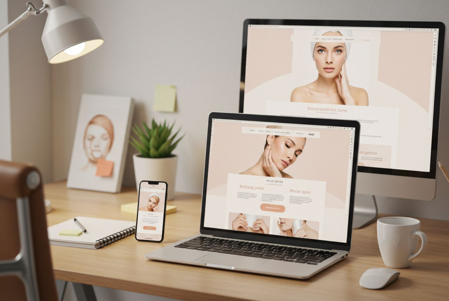
With people choosing to view websites from a wide range of smartphones, tablets, laptops and desktops, having a responsive website is more important than ever before.
H&P Design now offers a responsive web design package, which aims to give visitors to your website an optimal viewing experience by ensuring that it is easy to read with minimum need for resizing, panning or scrolling regardless of what device people are using to view the site.
When creating a website from scratch, a responsive design would always be our recommendation. This is because – regardless of how they’re viewing a site – people still want the full-screen experience when making a buying decision.
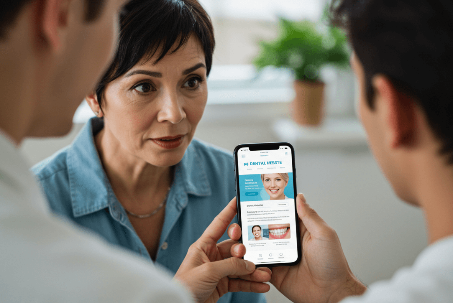
Mobile phones tend to be the platform of choice for convenience and immediate information – for example, a person might use their phone during their lunch break or evening commute to check that you offer the service they need – but we all tend to use a desktop or iPad when we want a more comprehensive consumer experience. A responsive web design ensures that visitors are offered a comparable degree of usability across all platforms. It also helps you present your brand identity consistently, however a visitor to your website finds it.
For our clients with larger websites who would prefer not to have a completely new responsive version of their site, we can create a simplified mobile-optimised version, which makes it easy for your customers to read about your services, treatments and home page, as well as booking an appointment from their smartphone. Mobile optimised websites work well because they streamline content for users on the move and are quicker to download.
The new James Willis Faces – Face to Face website illustrates how a responsive design can enhance the user experience. Menus, images, forms and copy are all easy to view without having to zoom in to the page. You can view it here – we’d love to know what you think.
Call the H&P Design team today 0115 9140 640
Improve your business’ online appeal with our experience in web design.
