There's something different about working with a client who's also a neighbour.
Pro Aesthetics have been part of the Nottingham scene for years — and so have we. When they came back to us to reimagine their website, it wasn't just a brief. It was a conversation between two businesses who'd grown up alongside each other, with a shared understanding of what the clinic had become and where it was heading.

We'd built their previous site. This time, we wanted to build something that made that one look like a rough draft.
The goal was conversion — but not in the cold, transactional sense. The site needed to take someone who'd stumbled across Pro Aesthetics and turn them into a booked appointment. That meant being clear, compelling, and confident from the first scroll. The homepage does a lot of work: treatments, skin concerns, their skincare shop, membership packages — all of it surface-level enough to orient a new visitor, detailed enough to satisfy someone who already knows what they want.


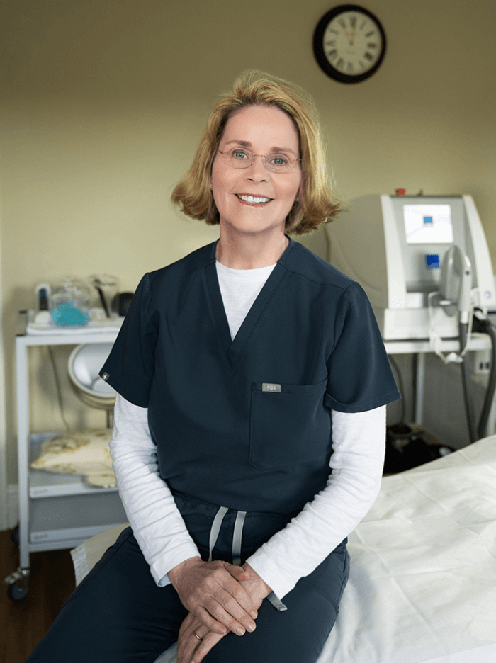
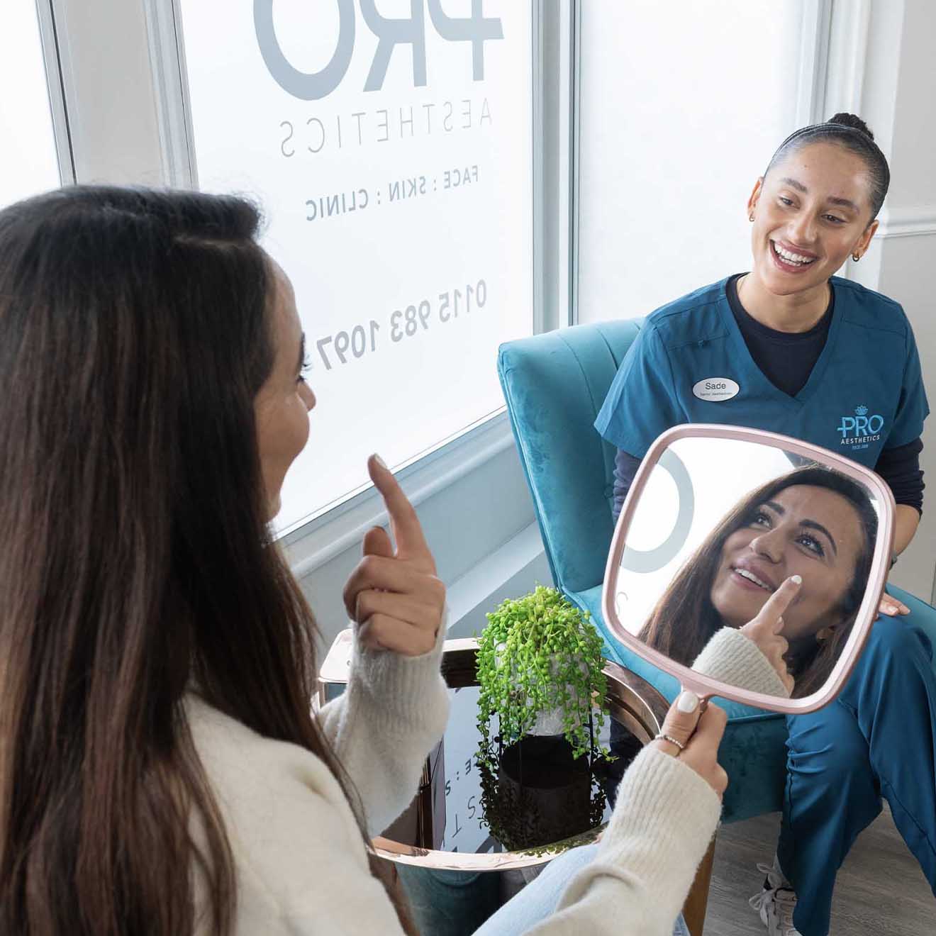
The design is unapologetically bold. Black as the foundation, rose gold as the accent — a palette that says luxury without having to announce it. The photography, shot in the clinic itself, does what no stock image ever could: it shows people exactly what walking through that door feels like.

That honesty runs through the whole site. The team, their approach, what makes them a clinic of choice not just locally but beyond — it's all there, and it feels earned rather than claimed.

It's one of our favourites. And a reminder that behind every website we're genuinely proud of, there's a client who made it possible.