Ten years with the same client changes how you work together. There's no onboarding, no explaining from scratch, no time spent establishing what good looks like. You already know.
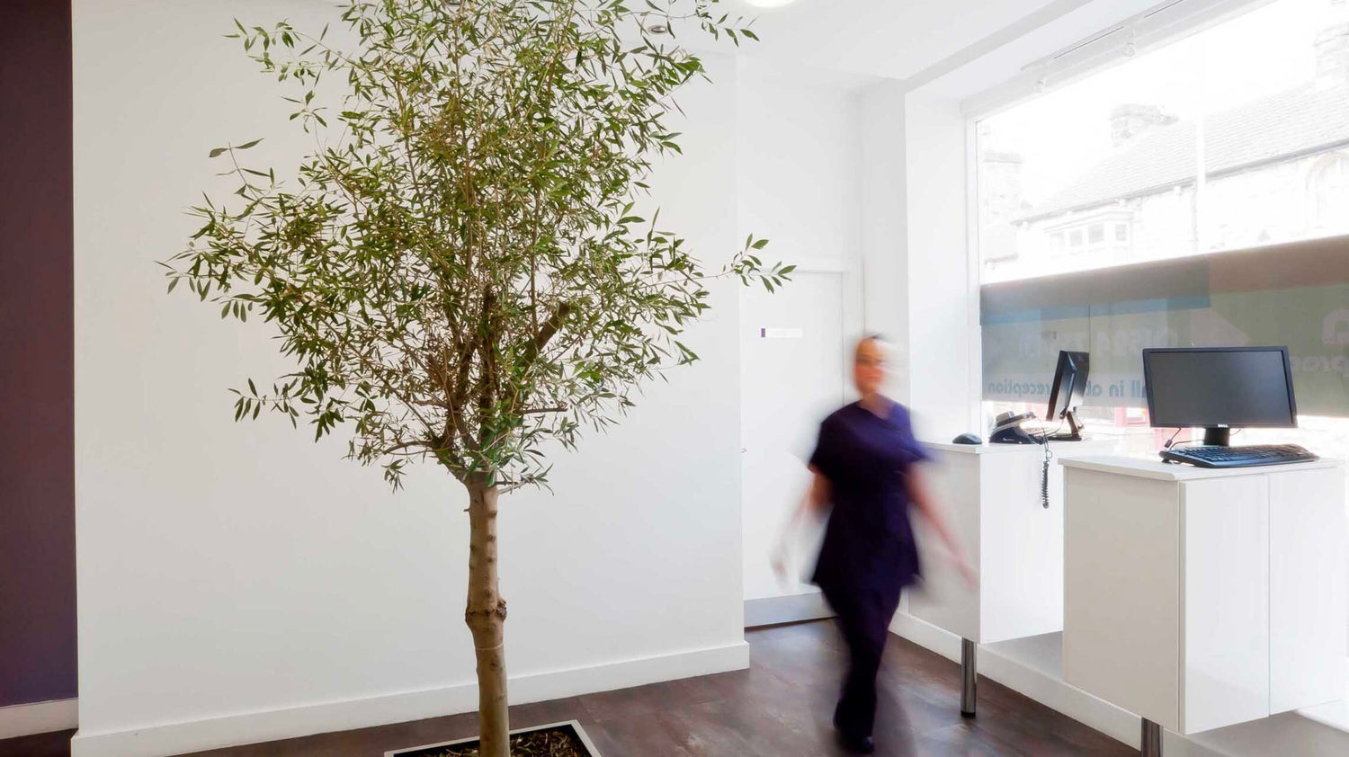
What makes Viva Dental different, and what's always made the work different, is that the owner is an architect. The visual standard isn't something we bring, and he approves. It comes from him. The brief is exacting not because it's demanding, but because the person setting it has spent a career thinking about how environments feel. How a space communicates before a single word is read. How detail, proportion and restraint create authority.

When Viva first came to us, it was a new practice and a clean slate. This is the second website. The brief reflected where the business has grown to, and where it's going.
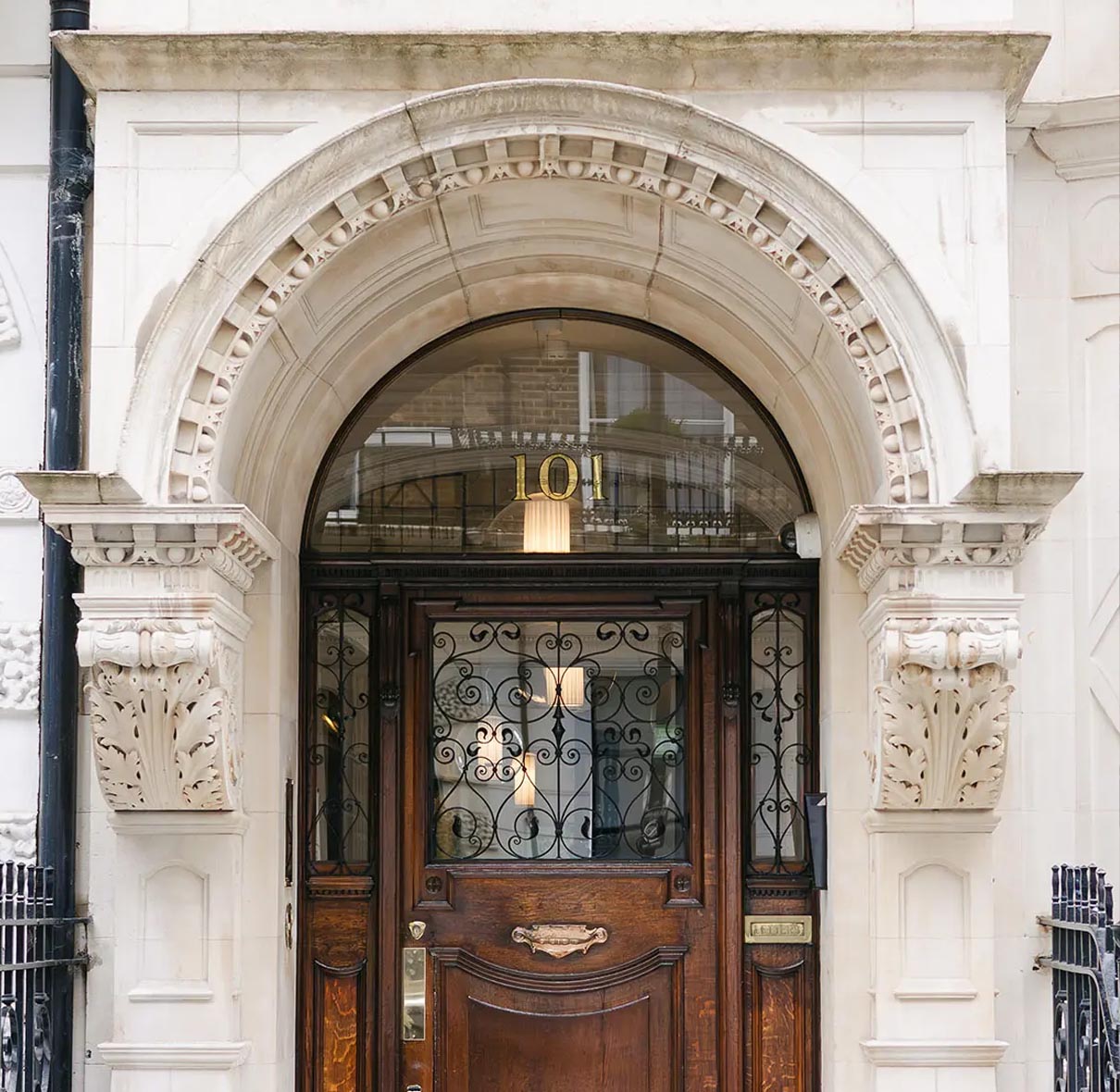
The practice sits at 29 Market Street in Carnforth, serving patients across Lancashire and Lancaster with a reputation built on preventative care, patient comfort, and a clinical environment that people notice when they walk in. GDC, BDA and CQC registered. A team committed to the kind of dentistry that reduces the need for treatment rather than simply performing it. The Healthy Mouth Review, the hygiene therapy program, the children's dental care, all of it in service of the same philosophy: keep the mouth well, and the rest follows.

The treatment range is comprehensive: oral health and preventative care, hygiene therapy, new patient exams, children's dental care, veneers, composite bonding, teeth whitening, white fillings, crowns, bridges, root fillings, cosmetic dentures, snoring solutions, and the full dental implant pathway from single implants through to implant-retained dentures. But what sits at the centre of how Viva operates, and what the site is built around, is the membership plan. Not as a bolt-on, not as a pricing option buried in a footer, but as the primary way a patient engages with the practice. The site frames membership as the relationship with Viva, because that's what it is.

The design earned its brief. Editorial in feel. Magazine-style layouts with generous white space, considered typography and imagery that treats the practice and its patients as the visual material rather than dressing for it. The pace of the page mirrors the pace of the practice, calm, deliberate, modern. It respects the architectural sensibility behind the brand and still works hard commercially, with clear routes to membership, new patient enquiries and individual treatments throughout.
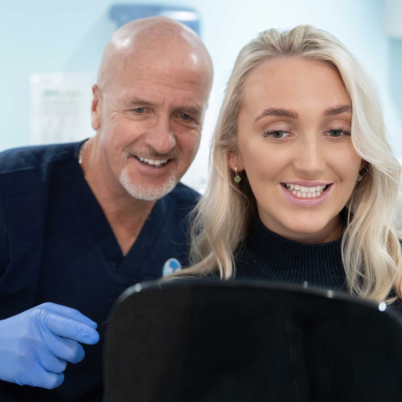
A practice tour gives new patients a feel for the environment before they've visited. Clear fees, a straightforward enquiry route, and a promise, not a list of credentials, but an actual promise about the care patients will receive. It's the kind of detail that reflects a practice that has thought carefully about how patients move through it, online and in person.
A second chapter, written in the same hand.